## animated
## Animated
AnimatedLegendList supports animated props with React Native's Animated.
```jsx
import { useEffect, useRef } from "react";
import { Animated } from "react-native";
import { AnimatedLegendList } from "@legendapp/list/animated";
export function AnimatedExample() {
const animated = useRef(new Animated.Value(0)).current;
useEffect(() => {
Animated.timing(animated, {
toValue: 1,
duration: 1000,
useNativeDriver: true,
}).start();
}, []);
return (
);
}
```
Note that this is just a wrapper around the normal `createAnimatedComponent` so you can use that if you prefer.
```ts
const AnimatedLegendList = Animated.createAnimatedComponent(LegendList);
```
## Reanimated
The Reanimated version of AnimatedLegendList supports animated props with Renimated. Note that using `Animated.createAnimatedComponent` will not work as it needs more boilerplate, so you should use this instead.
```jsx
import { useEffect } from "react";
import { AnimatedLegendList } from "@legendapp/list/reanimated";
import Animated, { useSharedValue, useAnimatedStyle, withSpring } from "react-native-reanimated";
export function ReanimatedExample() {
const scale = useSharedValue(0.8);
useEffect(() => {
scale.value = withSpring(1);
}, []);
return (
({
transform: [{ scale: scale.value }]
}))}
/>
);
}
```
## Keyboard Controller
LegendList integrates with the `KeyboardAvoidingView` in [react-native-keyboard-controller](https://github.com/kirillzyusko/react-native-keyboard-controller) for smoother keyboard interactions. Note that it is important to use `behavior="position"` for best compatibility with Legend List.
This is currently working less than ideally with Legend List v2 and we will try to fix it soon. If you need it asap please [post an issue](https://github.com/LegendApp/legend-docs/issues) or [talk to Jay on Twitter](https://twitter.com/jmeistrich).
```jsx
import { KeyboardAvoidingView, KeyboardProvider } from "react-native-keyboard-controller";
import { LegendList } from "@legendapp/list/keyboard-controller";
export function KeyboardControllerExample() {
return (
);
}
```
## examples/chat-interfaces
## Chat Interfaces Without `inverted`
In other list libraries if you wanted items to start scrolling from the bottom, you'd need to use an `inverted` prop, which would apply a negative scale transform. But that causes a lot of weird issues, so Legend List explicitly does not do that.
```ts
alignItemsAtEnd?: boolean;
maintainScrollAtEnd?: boolean;
maintainScrollAtEndThreshold?: number;
```
Instead, to align items at the end you can just use the `alignItemsAtEnd` prop, which will apply padding above items to fill the screen and stick them to the bottom.
The `maintainScrollAtEnd` prop will check if you are already scrolled to the bottom when `data` changes, and if so it keeps you scrolled to the bottom.
The `maintainScrollAtEndThreshold` prop (which defaults to 0.1) defines what percent of the screen counts as the bottom.
So using Legend List for a chat interface would look like this:
```tsx
{item.title}}
estimatedItemSize={320}
alignItemsAtEnd
maintainScrollAtEnd
maintainScrollAtEndThreshold={0.1}
/>
```
## examples/infinite-scrolling
## Two-way infinite scrolling
```ts
onStartReached?: ((info: { distanceFromStart: number }) => void) | null | undefined;
onStartReachedThreshold?: number;
onEndReached?: ((info: { distanceFromEnd: number }) => void) | null | undefined;
onEndReachedThreshold?: number;
```
These callbacks fire when you scroll to the top or bottom of a list. This can be used to load more data in either direction. In a typical list you'll likely just use `onEndReached` to load more data when the users scrolls to the bottom.
If you have a chat-like interface you may want to load more messages as you scroll up, and you can use `onStartReached` for that. If you are doing that, you will very likely want to use [maintainVisibleContentPosition](../../props#maintainvisiblecontentposition) so that the items loading above don't shift the viewport down.
## Example Implementation
```tsx
import { LegendList } from "@legendapp/list";
import { useState, useCallback } from "react";
export function InfiniteScrollExample() {
const [data, setData] = useState(initialData);
const [loading, setLoading] = useState(false);
const loadMoreAtEnd = useCallback(async () => {
if (loading) return;
setLoading(true);
try {
const newItems = await fetchMoreItems(data.length);
setData(prev => [...prev, ...newItems]);
} finally {
setLoading(false);
}
}, [data.length, loading]);
const loadMoreAtStart = useCallback(async () => {
if (loading) return;
setLoading(true);
try {
const newItems = await fetchPreviousItems(data[0]?.id);
setData(prev => [...newItems, ...prev]);
} finally {
setLoading(false);
}
}, [data, loading]);
return (
}
keyExtractor={item => item.id}
onEndReached={loadMoreAtEnd}
onStartReached={loadMoreAtStart}
onEndReachedThreshold={0.5}
onStartReachedThreshold={0.5}
recycleItems
/>
);
}
```
## getting-started
Legend List is a high performance virtualized ScrollView library for React Native. Compared to FlatList and FlashList it's faster, simpler, and has useful features they don't support.
- ✨ Extremely fast
- ✨ Dynamic item sizes
- ✨ Optional recycling
- ✨ Bidirectional infinite lists
- ✨ Chat list without inverting
- ✨ Maintain content view position
- ✨ Recycling hooks
For more information, check out:
- [Legend List: Optimizing for Mobile & Web | React Universe Conf 2025](https://www.youtube.com/watch?v=Ui3qVl80Pzg)
- [Legend List: Optimizing for Peak List Performance | App.js Conf 2025](https://www.youtube.com/watch?v=4nfxSE9OByQ)
- [Jay's conversation on React Native Radio](https://infinite.red/react-native-radio/rnr-325-legend-list-with-jay-meistrich)
## It's fast!
This video was recorded as a performance test scrolling ludicrously fast with heavy items. LegendList handles expensive components with a quick recovery.
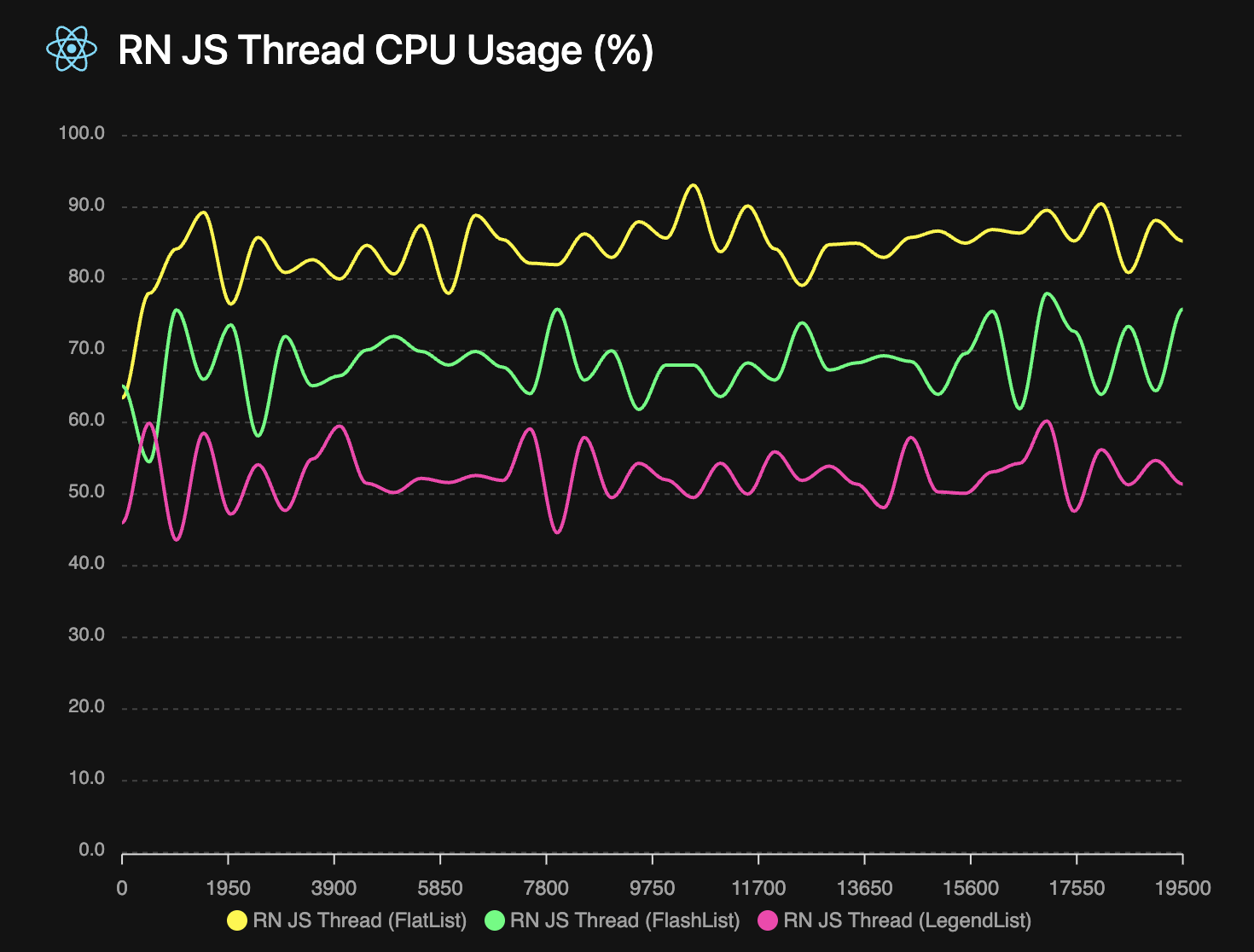
## It uses less resources
A FlashLight measurement of the above test shows that LegendList uses less CPU while scrolling. And it uses less memory too! See the [FlashLight results](/open-source/list/flashlight.html) for more details.
## Install
```npm
npm install @legendapp/list
```
## Usage
Legend List is a virtualized ScrollView component for React Native with optional recycling, that can massively increase performance of rendering long lists. Rather than rendering every item in the list, it only renders the items that are in view, which significantly reduces the amount of items that need to render.
Legend List is a drop-in replacement for FlatList or FlashList. So since you're likely coming from one of those, we'll start with a guide on how to switch.
### Quick Start
```jsx
import { Text } from "react-native";
import { LegendList } from "@legendapp/list";
const items = [
{ id: "1", title: "Item 1" },
{ id: "2", title: "Item 2" },
{ id: "3", title: "Item 3" },
];
export function MyList() {
return (
{item.title}}
keyExtractor={(item) => item.id}
recycleItems
/>
);
}
```
### Switch from FlashList
If you're coming from FlashList, in most cases you can just rename the component and it will work as expected. But note that Legend List does not recycle items by default, so to match FlashList's behavior you can enable `recycleItems`. See [Recycling Items](../performance#recycling-list-items) for more details of recycling behavior.
```diff
return (
- {item.title}}
+ recycleItems
/>
)
```
### Switch from FlatList
If you're coming from FlatList, Legend List should immediately be much faster. But you may want to add the `recycleItems` prop to add extra performance.
```diff
return (
- {item.title}}
+ recycleItems
/>
)
```
See [Props](../props) for all properties of LegendList.
## Supported Platforms
- Android
- iOS
- React Native Web
- React Native MacOS
- React Native Windows
- TV platforms
- Any React Native platform should work since there's no native code, but if not please let us know!
## Community
Join us on [Discord](https://discord.gg/5CBaNtADNX) or [Github](https://github.com/LegendApp/legend-list) to get involved with the Legend community.
Talk to Jay on [Bluesky](https://bsky.app/profile/jayz.us) or [Twitter](https://twitter.com/jmeistrich).
## Contributing
We welcome contributions! Please read our [Contributing Guide](https://github.com/LegendApp/legend-list) on Github. And we welcome documentation PRs in our [documentation repo](https://github.com/LegendApp/legend-docs).
## Legend Kit
Legend Kit is our early but growing collection of high performance headless components, general purpose observables, transformer computeds, React hooks that don't re-render, and observable tools for popular frameworks. [Check out Legend Kit](https://www.legendapp.com/kit) to learn more.
## performance
Legend List is very optimized by default, so it may already be working well without any configuration. But these are some common ways to improve your list behavior.
It's important to provide an `estimatedItemSize` (if items are the same size or all dynamic sizes) or `getEstimatedItemSize` (if items are different known sizes). Legend List uses this as the default item size, then as items are rendered it updates their positions with the actual size. So getting this estimate as close as possible to the real size will reduce layout shifting and blank spaces as items render. If not provided it will use `100px` as the default.
The `onItemSizeChanged` event can also help with your estimations - it will be called whenever an item's size changes. So you can use it to log what the actual rendered size is to adjust your estimates.
### Use `keyExtractor` Prop
```ts
keyExtractor?: (item: T, index: number) => string;
```
The `keyExtractor` prop lets Legend List save item layouts by key, so that if the `data` array changes it can reuse previous layout information and only update the changed items. Without `keyExtractor`, item sizes will reset to their default whenever `data` changes. So it is *very recommended* to have a `keyExtractor` if `data` ever changes. If your items are a fixed size, providing a `keyExtractor` that returns the index will tell it to reuse size information.
### Recycling List Items
```ts
recycleItems?: boolean // default: false
```
Legend List has an optional `recycleItems` prop which enables view recycling. This will reuse the component rendered by your `renderItem` function. This can be a big performance optimization because it does not need to destroy/create views while scrolling. But it also reuses any local state, which can cause some weird behavior that may not be desirable depending on your app. But see the [recycling hooks](../props#userecyclingstate) to make that easier.
So there are some tradeoffs with recycling:
- 👍 If you have items with no state then recycling should be great
- 👎 If you have simple items with complex state then it may be more trouble than it's worth
- 👍 If you have heavy items with complex state then working around the state recycling may be worth it for the performance gains
### Estimate Item Sizes
```ts
estimatedItemSize?: number;
getEstimatedItemSize?: (index: number, item: T, itemType?: string) => number;
getFixedItemSize?: (index: number, item: T, itemType?: string) => number | undefined; // (v2)
onItemSizeChanged?: (info: {
size: number;
previous: number;
index: number;
itemKey: string;
itemData: ItemT;
}) => void;
```
If your list elements are a fixed size, then use `getFixedItemSize` to skip all of the work of measuring and adjusting items.
Providing accurate item size estimates helps determine the number of containers to allocate, based on screen size / estimatedItemSize. `estimatedItemSize` is used only for the first render, then Legend List switches to using the average of actually rendered item sizes. If you provide `getEstimatedItemSize`, it will use that function instead of averages. The more accurate your initial estimates, the better the first render experience.
Use `onItemSizeChanged` to log actual vs estimated sizes and improve your estimates over time. It's generally better to slightly underestimate than overestimate item sizes. Without estimates, Legend List defaults to 100px which will likely cause scrollbar jumping and layout issues.
### Set DrawDistance Prop
```ts
drawDistance?: number // default: 250
```
The `drawDistance` (defaults to `250`) is the buffer size in pixels above and below the viewport that will be rendered in advance. So for example if your screen is `2000px` tall and your draw distance is `1000`, then it will render double your screen size, from `-1000px` above the viewport to `1000px` below the viewport.
This can help reduce the amount of blank space while scrolling quickly. But if your items are computationally expensive, it may reduce performance because more items are rendering at once. So you should experiment with it to find the most optimal behavior for your app.
### Set `waitForInitialLayout` Prop
```ts
waitForInitialLayout?: boolean // default: true
```
If the size of your list items differs significantly from the estimate, you may see a layout jump after the first render. If so, the `waitForInitialLayout` prop solves that by delaying displaying list items by one frame so they start at the correct position. But, if you have fixed sized items then you may not want to disable it to avoid waiting a frame.
## props
Below is a list of all the properties for LegendList:
## Required Props
___
### data
```ts
data: ItemT[];
```
An array of the items to render. This can also be an array of keys if you want to get the item by key in [renderItem](#renderitem).
### renderItem
```ts
renderItem?: (props: { item: ItemT; index: number; extraData: any; itemType?: string }) => ReactNode;
```
Takes an item from data and renders it into the list. The `itemType` parameter is available when using `getItemType`.
See [React Native Docs](https://reactnative.dev/docs/flatlist#renderItem).
## Recommended Props
___
### keyExtractor
```ts
keyExtractor?: (item: ItemT, index: number) => string;
```
Highly recommended. The `keyExtractor` prop lets Legend List save item layouts by key, so that if the `data` array changes it can reuse previous layout information and only update the changed items. The value it returns should be unique to each item - if a value is reused for a different item it will cause big problems. It is okay to return the index, if list items are reordered or prepended, it will also cause big problems. See [Use key extractor](../performance#use-keyextractor).
If LegendList detects duplicate keys, it will log a warning.
### recycleItems
```ts
recycleItems?: boolean; // default: false
```
This will reuse the component rendered by your `renderItem` function. This can be a big performance improvement, but if your list items have internal state there's potential for undesirable behavior. For more information, see [Performance](../performance#recycling-list-items) for more information.
## Optional Props
___
### alignItemsAtEnd
```ts
alignItemsAtEnd?: boolean; // default: false
```
Aligns to the end of the screen. If there's only a few items, Legend List will add padding to the top to align them to the bottom. See [Chat interfaces without inverted](../examples/chat-interfaces) for more.
### columnWrapperStyle
```ts
columnWrapperStyle?: StyleProp;
```
Style applied to each column's wrapper view.
### contentContainerStyle
```ts
contentContainerStyle?: StyleProp;
```
Style applied to the underlying ScrollView's content container.
### drawDistance
```ts
drawDistance?: number;
```
The `drawDistance` (defaults to `250`) is the buffer size in pixels above and below the viewport that will be rendered in advance. See [Performance](../performance#set-drawdistance-prop) for more.
### estimatedItemSize
```ts
estimatedItemSize?: number;
```
An estimated size for all items which is used to estimate the list layout before items actually render. This can help to provide a hint for how large items will be in the first frame and can speed up initial layout, but subsequent renders will use the average item size.
### extraData
```ts
extraData?: any;
```
Extra data to trigger re-rendering when changed.
See [React Native Docs](https://reactnative.dev/docs/flatlist#extraData).
### getEstimatedItemSize
```ts
getEstimatedItemSize?: (index: number, item: ItemT, itemType?: string) => number;
```
An estimated size for each item which is used to estimate the list layout before items actually render. If you don't provide this, it will log a suggested value for optimal performance.
### getFixedItemSize (v2)
```ts
getFixedItemSize?: (index: number, item: ItemT, itemType?: string) => number | undefined;
```
For items with known fixed sizes, this enables optimal performance as it disables the overhead of measuring and updating item size. Return a number for fixed-size items or undefined for dynamic-size items.
### getItemType (v2)
```ts
getItemType?: (item: ItemT, index: number) => string;
```
Allows categorizing different item types for better performance optimization. Items with the same type can be recycled more efficiently.
### horizontal
```ts
horizontal?: boolean; // default: false
```
Renders all items in the list in horizontal.
### initialContainerPoolRatio
```ts
initialContainerPoolRatio?: number; // default: 2
```
Ratio of initial container pool size to data length. The container pool is extra unallocated containers that are used in case the actual size is smaller than the estimated size. This defaults to `2` which we've found to cover most usage. If your items are a fixed size you could set it closer to `1`, or if your items or viewport can resize signficantly it may help to increase it. If the number of containers needed exceeds the pool, LegendList will allocate more containers and re-render the outer list, which may cause a frame stutter.
### initialScrollIndex
```ts
initialScrollIndex?: number;
```
Start scrolled with this item at the top. By default, to have accurate scrolling position you will need to provide accurate element positions to the [getEstimatedItemSize](#getestimateditemsize) function. When accurate positions are not known (e.g., for dynamically sized list items), please enable [maintainVisibleContentPosition](#maintainvisiblecontentposition) prop. This will allow LegendList to automatically adjust its top boundary when elements below initialScrollIndex will be measured.
### initialScrollOffset
```ts
initialScrollOffset?: number;
```
Start scrolled to this offset.
### ItemSeparatorComponent
```ts
ItemSeparatorComponent?: React.ComponentType<{ leadingItem: ItemT }>
```
Rendered in between each item, but not at the top or bottom.
See [React Native Docs](https://reactnative.dev/docs/flatlist#itemseparatorcomponent).
### ListEmptyComponent
```ts
ListEmptyComponent?: React.ComponentType | React.ReactElement | null | undefined;
```
Rendered when the list is empty.
See [React Native Docs](https://reactnative.dev/docs/flatlist#listemptycomponent).
### ListEmptyComponentStyle
```ts
ListEmptyComponentStyle?: StyleProp | undefined;
```
Styling for internal View for `ListEmptyComponent`.
### ListFooterComponent
```ts
ListFooterComponent?: React.ComponentType | React.ReactElement | null | undefined;
```
Rendered at the bottom of all the items.
See [React Native Docs](https://reactnative.dev/docs/flatlist#listfootercomponent).
### ListFooterComponentStyle
```ts
ListFooterComponentStyle?: StyleProp | undefined;
```
Styling for internal View for `ListFooterComponent`.
See [React Native Docs](https://reactnative.dev/docs/flatlist#listfootercomponentstyle).
### ListHeaderComponent
```ts
ListHeaderComponent?: React.ComponentType | React.ReactElement | null | undefined;
```
Rendered at the top of all the items.
See [React Native Docs](https://reactnative.dev/docs/flatlist#listheadercomponent).
### ListHeaderComponentStyle
Styling for internal View for `ListHeaderComponent`.
See [React Native Docs](https://reactnative.dev/docs/flatlist#listheadercomponentstyle).
### maintainScrollAtEnd
```ts
maintainScrollAtEnd?: boolean;
```
This will check if you are already scrolled to the bottom when `data` changes, and if so it keeps you scrolled to the bottom.
See [Chat interfaces without `inverted`](../examples/chat-interfaces) for more.
### maintainScrollAtEndThreshold
```ts
maintainScrollAtEndThreshold?: number;
```
This defines what percent of the screen counts as the bottom. Defaults to `0.1`.
See [Chat interfaces without `inverted`](../examples/chat-interfaces) for more.
### maintainVisibleContentPosition
```ts
maintainVisibleContentPosition?: boolean; // default: true
```
The `maintainVisibleContentPosition` prop automatically adjusts item positions when items are added/removed/resized above the viewport so that there is no shift in the visible content. This is very helpful for some scenarios, but if you have a static list of fixed sized items you probably don't need it.
- If items get added/removed/resized above the viewport, items will not move on screen
- When using `initialScrollOffset` or `initialScrollIndex`, items will not jump around when scrolling up if they're different sizes than the estimate
- When scrolling to an index far down the list and then back up, items will not jump around as they layout
LegendList utilizes ScrollView's [maintainVisibleContentPosition](https://reactnative.dev/docs/scrollview#maintainvisiblecontentposition) prop internally, so your target react-native version should support that prop. To use maintainVisibleContentPosition on Android you will need at least React Native version [0.72](https://github.com/facebook/react-native/commit/c19548728c9be3ecc91e6fefb35bc14929109d60).
### numColumns
```ts
numColumns?: number;
```
Multiple columns will zig-zag like a flexWrap layout. Rows will take the maximum height of their columns, so items should all be the same height - masonry layouts are not supported.
### onEndReached
```ts
onEndReached?: ((info: { distanceFromEnd: number }) => void) | null | undefined;
```
A callback that's called only once when scroll is within `onEndReachedThreshold` of the bottom of the list. It resets when scroll goes above the threshold and then will be called again when scrolling back into the threshold.
### onEndReachedThreshold
```ts
onEndReachedThreshold?: number | null | undefined;
```
The distance from the end as a percentage that the scroll should be from the end to trigger `onEndReached`. It is multiplied by screen size, so a value of 0.5 will trigger `onEndReached` when scrolling to half a screen from the end.
### onItemSizeChanged
```ts
onItemSizeChanged?: (info: {
size: number;
previous: number;
index: number;
itemKey: string;
itemData: ItemT;
}) => void;
```
Called whenever an item's rendered size changes. This can be used to adjust the estimatedItemSize to match the actual size, which can improve performance or reduce layout shifting.
### onRefresh
```ts
onRefresh?: () => void;
```
Called whenever a user pulls down to refresh. See [React Native Docs](https://reactnative.dev/docs/flatlist#onRefresh).
### onStartReached
```ts
onStartReached?: ((info: { distanceFromStart: number }) => void) | null | undefined;
```
A callback that's called only once when scroll is within `onStartReachedThreshold` of the top of the list. It resets when scroll goes below the threshold and then will be called again when scrolling back into the threshold.
### onStartReachedThreshold
```ts
onStartReachedThreshold?: number | null | undefined;
```
The distance from the start as a percentage that the scroll should be from the end to trigger `onStartReached`. It is multiplied by screen size, so a value of 0.5 will trigger `onStartReached` when scrolling to half a screen from the start.
### onViewableItemsChanged
```ts
onViewableItemsChanged?: OnViewableItemsChanged | undefined;
```
Called when the viewability of rows changes, as defined by the `viewabilityConfig` prop.
See [React Native Docs](https://reactnative.dev/docs/flatlist#onviewableitemschanged).
### progressViewOffset
```ts
progressViewOffset?: number | undefined;
```
Offset in pixels for the refresh indicator.
### ref
```ts
ref?: LegendListRef;
```
Used to call `scrollTo` [methods](#ref-methods).
### refreshing
```ts
refreshing?: boolean;
```
Set this true while waiting for new data from a refresh.
See [React Native Docs](https://reactnative.dev/docs/flatlist#refreshing).
### renderScrollComponent
```ts
renderScrollComponent?: (props: ScrollViewProps) => ReactNode
```
Render a custom ScrollView component. This allows customization of the underlying ScrollView.
Note that passing `renderScrollComponent` as an inline function might cause you to lose scroll position if the list is rerendered.
```tsx
renderScrollComponent={(props) => }
```
Instead, it's better to extract it as a custom component.
```tsx
const CustomScrollView = (props: ScrollViewProps) => {
return ;
};
```
### snapToIndices (v2)
```ts
snapToIndices?: number[];
```
An array of indices that the scroll position can snap to. When scrolling stops near one of these indices, the scroll position will automatically adjust to align with that item.
### stickyIndices (v2)
```ts
stickyIndices?: number[];
```
An array of indices for items that should stick to the top of the list while scrolling. Sticky headers remain visible at the top of the viewport as you scroll past them.
### style
```ts
style?: StyleProp;
```
Style applied to the underlying ScrollView.
### viewabilityConfig
```ts
viewabilityConfig?: ViewabilityConfig;
```
Configuration for when to update the `onViewableItemsChanged` callback.
See [React Native Docs](https://reactnative.dev/docs/flatlist#viewabilityconfig).
### viewabilityConfigCallbackPairs
```ts
viewabilityConfigCallbackPairs?: ViewabilityConfigCallbackPairs | undefined;
```
List of `ViewabilityConfig`/`onViewableItemsChanged` pairs. A specific `onViewableItemsChanged` will be called when its corresponding `ViewabilityConfig`'s conditions are met.
See [React Native Docs](https://reactnative.dev/docs/flatlist#viewabilityconfigcallbackpairs).
### waitForInitialLayout
```ts
waitForInitialLayout?: boolean; // default true
```
If true, delays rendering until initial layout is complete
## Ref Methods
___
### getState
```ts
getState: () => {
contentLength: number;
data: ItemT[];
end: number;
endBuffered: number;
isAtEnd: boolean;
isAtStart: boolean;
positionAtIndex: (index: number) => number;
scroll: number;
scrollLength: number;
start: number;
startBuffered: number;
}
```
Returns the internal scroll state of the list. New in v2: includes `data` for debugging, `positionAtIndex` function for getting the scroll position of any index.
### scrollToIndex
```ts
scrollToIndex: (params: {
index: number;
animated?: boolean;
});
```
Scrolls to the item at the specified index. By default ([maintainVisibleContentPosition](#maintainvisiblecontentposition) is false), accurate scroll is guaranteed only if all accurate sizes of elements are provided to [getEstimatedItemSize](#getestimateditemsize) function(similar FlatList).
If estimated item sizes are not known, [maintainVisibleContentPosition](#maintainvisiblecontentposition) prop need to be set to true. In this mode, list would automatically select element you are scrolling to as anchor element and guarantee accurate scroll.
### scrollToOffset
```ts
scrollToOffset(params: {
offset: number;
animated?: boolean;
});
```
Scroll to a specific content pixel offset in the list.
Valid parameters:
- *offset* (number) - The offset to scroll to. In case of horizontal being true, the offset is the x-value, in any other case the offset is the y-value. Required.
- *animated* (boolean) - Whether the list should do an animation while scrolling. Defaults to true.
### scrollToItem
```ts
scrollToItem(params: {
animated?: ?boolean,
item: Item,
});
```
Requires linear scan through data - use [scrollToIndex](#scrolltoindex) instead if possible. Provided for compatibility with FlatList only.
Valid parameters:
- *animated* (boolean) - Whether the list should do an animation while scrolling. Defaults to true.
- *item* (object) - The item to scroll to. Required.
### scrollToEnd
```ts
scrollToEnd(params?: {
animated?: boolean,
});
```
Scrolls to the end of the list.
Valid parameters:
- *animated* (boolean) - Whether the list should do an animation while scrolling. Defaults to true.
### scrollIndexIntoView
Scrolls the index into view. If the index is above the viewable range it will be scrolled to the top of the screen, and if it's below the viewable range it will be scrolled to the bottom of the screen.
```ts
scrollIndexIntoView(params: {
animated?: boolean | undefined;
index: number;
}): void
```
```jsx
import { useRef } from "react";
import { Button } from "react-native";
import { LegendList } from "@legendapp/list";
export function ScrollExample() {
const listRef = useRef(null);
const scrollToItem = () => {
// Scroll to the item at index 10
listRef.current?.scrollIndexIntoView(10);
};
return (
<>
);
}
```
### scrollItemIntoView
Scrolls the item into view. If the item is above the viewable range it will be scrolled to the top of the screen, and if it's below the viewable range it will be scrolled to the bottom of the screen.
```ts
scrollItemIntoView(params: {
animated?: boolean | undefined;
item: any;
}): void;
```
```jsx
import { useRef } from "react";
import { Button } from "react-native";
import { LegendList } from "@legendapp/list";
export function ScrollToItemExample() {
const listRef = useRef(null);
const targetItem = { id: "item-5", text: "Target Item" };
const scrollToSpecificItem = () => {
// Scroll to the item that matches targetItem
listRef.current?.scrollItemIntoView(targetItem);
};
return (
<>
);
}
```
## Hooks
### useRecyclingState
```ts
interface LegendListRecyclingState {
item: T;
prevItem: T | undefined;
index: number;
prevIndex: number | undefined;
}
useRecyclingState: (updateState: ((info: LegendListRecyclingState) => T) | T) => [T, Dispatch];
```
`useRecyclingState` automatically resets the state when an item is recycled into a new item.
```tsx
import { useRecyclingState } from "@legendapp/list"
export function ItemComponent({ item }) {
// Like useState but it resets when the item is recycled
const [isExpanded, setIsExpanded] = useRecyclingState(() => false);
// ...
}
```
### useRecyclingEffect
```ts
interface LegendListRecyclingState {
item: T;
prevItem: T | undefined;
index: number;
prevIndex: number | undefined;
}
useRecyclingEffect: (effect: (info: LegendListRecyclingState) => void | (() => void)) => void;
```
`useRecyclingEffect` can be used to reset any side effects when an item gets recycled.
```tsx
import { useRef } from "react";
import { useRecyclingEffect } from "@legendapp/list"
export function ItemComponent({ item }) {
const refSwipeable = useRef(null);
const refVideo = useRef(null);
// A callback when the item is recycled into a new item
useRecyclingEffect(({ item, prevItem, index, prevIndex }) => {
// Reset any side effects from the previous item
refSwipeable?.current?.close();
refVideo?.current?.reset();
});
// ...
}
```
### useViewability
```ts
interface ViewToken {
containerId: number;
index: number;
isViewable: boolean;
item: ItemT;
key: string;
}
useViewability: (configId: string, callback: (viewToken: ViewToken) => void) => void;
```
A hook that provides callbacks when an item's viewability changes. This hook registers a callback that will be invoked whenever the item's visibility status changes, providing detailed information about the item through the ViewToken interface. It is similar to [onViewableItemsChanged](#onviewableitemschanged) but runs for only the rendering item. If you defined multiple viewability configs using [viewabilityConfigCallbackPairs](#viewabilityconfigcallbackpairs) then provide the id of the one you're interested in with `configId`.
```tsx
import { useState } from "react";
import { View, Text } from "react-native";
import { useViewability } from "@legendapp/list"
export function ItemComponent({ item }) {
const [isVisible, setIsVisible] = useState(false);
useViewability((viewToken) => {
// Called when viewability changes
setIsVisible(viewToken.isViewable);
if (viewToken.isViewable) {
console.log("Item visible:", viewToken.item);
console.log("Item index:", viewToken.index);
}
}, "main");
return (
{isVisible ? : }
);
}
```
### useViewabilityAmount
```ts
interface ViewAmountToken {
containerId: number;
index: number;
isViewable: boolean;
item: ItemT;
key: string;
percentOfScroller: number;
percentVisible: number;
scrollSize: number;
size: number;
sizeVisible: number;
}
useViewabilityAmount: (callback: (viewAmountToken: ViewAmountToken) => void) => void;
```
A hook that provides detailed metrics about how much of an item is visible in the viewport. The callback receives a ViewAmountToken with information like the pixel measurements (sizeVisible, size), percentage visible, and more.
```tsx
import { useState } from "react";
import { Animated, Text } from "react-native";
import { useViewabilityAmount } from "@legendapp/list"
export function ItemComponent({ item }) {
const [opacity, setOpacity] = useState(0);
useViewabilityAmount((viewAmountToken) => {
// Get detailed visibility information
setOpacity(viewAmountToken.percentVisible);
// Additional metrics available:
// viewAmountToken.sizeVisible - pixels of item visible in viewport
// viewAmountToken.size - total size of the item
// viewAmountToken.percentOfScroller - what percent of the scroller this item takes up
// viewAmountToken.scrollSize - size of the viewport
});
return (
{item.title}
);
}
```
### useSyncLayout (v2)
```ts
useSyncLayout: (callback: () => void) => void;
```
A hook for synchronizing layout operations. This is useful for advanced use cases where you need to coordinate layout updates with other components or operations.
```tsx
import { View, Text } from "react-native";
import { useSyncLayout } from "@legendapp/list"
export function ItemComponent({ item }) {
useSyncLayout(() => {
// This callback will be called when layout operations are synchronized
console.log("Layout synchronized for item:", item.id);
});
return (
{item.title}
);
}
```
## version-2
Version 2 is faster, more accurate, and smaller. There are no breaking changes, but it's almost a full rewrite, so we're calling it a major version!
This update is primarily focused on accuracy and performance. The `maintainVisibleContentPosition` algorithm was rewritten in a way that's much more accurate and performant, and also allowed us to remove a ton of hacks, workarounds, and lots of management code.
The new simpler implementation of `maintainVisibleContentPosition` enabled new features like sticky headers.
Many features were added to support advanced customization and behaviors for complex lists like AI chats.
## Install the update
```npm
@legendapp/list
```
## 🎉 Major Improvements
### Accuracy
- Perfectly accurate `initialScrollIndex`, `scrollToIndex`, and `scrollToEnd`
- Bidirectional infinite scroll never has any flashing or jumpiness
- Uses average sizes after the first render so `estimatedItemSize` is now optional
### Scroll Performance
- `maintainVisibleContentPosition` is so much better and faster that it's now enabled by default
- Reduced number/size of renders while updating positions
- Improved container recycling to reuse containers more efficiently
## ✨ New Features
### Sticky Headers
- `stickyIndices` prop for creating sticky headers that remain visible while scrolling
### Enhanced Item Type System
- `getItemType` prop allows categorizing different item types for better performance optimization
- `getFixedItemSize` prop for items with known fixed sizes, enabling performance optimizations
- `renderItem`, `getFixedItemSize`, and `getEstimatedItemSize` functions now receive an item type parameter
### Lazy List
- Built-in lazy list support directly in the `LegendList` component
### Scroll Position Management
- `snapToIndices` prop for snapping scroll position to specific item indices
- `maintainVisibleContentPosition` is now enabled by default for better scroll stability
### Advanced Hooks and References
- `useSyncLayout` hook for synchronizing layout operations
- Ref function to enable/disable scroll processing for advanced use cases
- `getState()` now includes `positionAtIndex` and `data` for debugging and advanced integrations
### Code Quality
- Extracted most functionality into small, testable functions
- Added extensive test infrastructure
## 🔄 Migration Guide
### From v1 to v2
Most v2 changes are backward compatible, but note this one change:
1. `maintainVisibleContentPosition` now defaults to `true`. It has no significant overhead so it should be fine to leave it enabled. It's required for accurate `initialScrollIndex`, `scrollToIndex`, and infinite scrolling up.
 ## Install
```npm
npm install @legendapp/list
```
## Usage
Legend List is a virtualized ScrollView component for React Native with optional recycling, that can massively increase performance of rendering long lists. Rather than rendering every item in the list, it only renders the items that are in view, which significantly reduces the amount of items that need to render.
Legend List is a drop-in replacement for FlatList or FlashList. So since you're likely coming from one of those, we'll start with a guide on how to switch.
### Quick Start
```jsx
import { Text } from "react-native";
import { LegendList } from "@legendapp/list";
const items = [
{ id: "1", title: "Item 1" },
{ id: "2", title: "Item 2" },
{ id: "3", title: "Item 3" },
];
export function MyList() {
return (
## Install
```npm
npm install @legendapp/list
```
## Usage
Legend List is a virtualized ScrollView component for React Native with optional recycling, that can massively increase performance of rendering long lists. Rather than rendering every item in the list, it only renders the items that are in view, which significantly reduces the amount of items that need to render.
Legend List is a drop-in replacement for FlatList or FlashList. So since you're likely coming from one of those, we'll start with a guide on how to switch.
### Quick Start
```jsx
import { Text } from "react-native";
import { LegendList } from "@legendapp/list";
const items = [
{ id: "1", title: "Item 1" },
{ id: "2", title: "Item 2" },
{ id: "3", title: "Item 3" },
];
export function MyList() {
return (